

Infographics: Powerful Tools for Vision-Casting Leaders
Infographics are more than just eye-catching visuals—they’re tools that help leaders communicate vision, clarify complex ideas, and inspire action. While they may take more time and resources to create than a traditional document, their value and longevity often far exceed the investment to create them.
Organizations use infographics for a variety of purposes. Recently, I worked with a team to develop an Ecosystem Infographic for their organization. Their reaction? “We had no idea our impact reached so many other organizations in our community!” But there are many reasons to use organizational infographics.
Uses for Infographics
1. Visual Storytelling
Stories can be in written form, but more often, stories are best told with the addition of visual pictures to help bring the story to life. This is the case with business and organizational stories that might give a historic timeline of information or might tell the “why” behind an organization’s existence through pictures of people, places, things, or events.
2. Giving Instructional Information
Information can be understood more quickly and clearly when shown in pictures and diagrams vs being written out (and sometimes misinterpreted). Informative Infographics deliver insight at a glance and resonate especially well with visual learners and those needing to follow a step-by-step process.
Offering a snapshot view to all or part of an organization can be invaluable for c-suite leaders, board of directors, donors, or specific stakeholders. While written executive summaries are a business norm, executive infographics are far preferred by executives because of how quickly the information can be read, understood, and memorized.
3. Offering Visual Executive Summaries
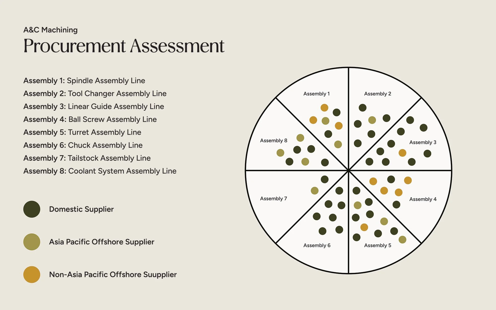
4. Organizing Complex Data Sets
Few people enjoy reading through pages of data, but many people are interested in data finding at a high level, especially when the data report represents organizational information and performance. Marketplace Ecosystem Infographics are a great example of a data set infographic. (see below)
Types of Infographics
1. Historical Timelines

Historical Timelines are excellent for documenting an organization’s history. They highlight key milestones, challenges, and successes, offering insight into the organization’s identity and resilience.
2. Roadmaps
Roadmaps communicate both where an organization has been and where it’s headed. As the saying goes, “What gets written down gets done.” Roadmaps help stakeholders understand the vision in its simplest form—visually.

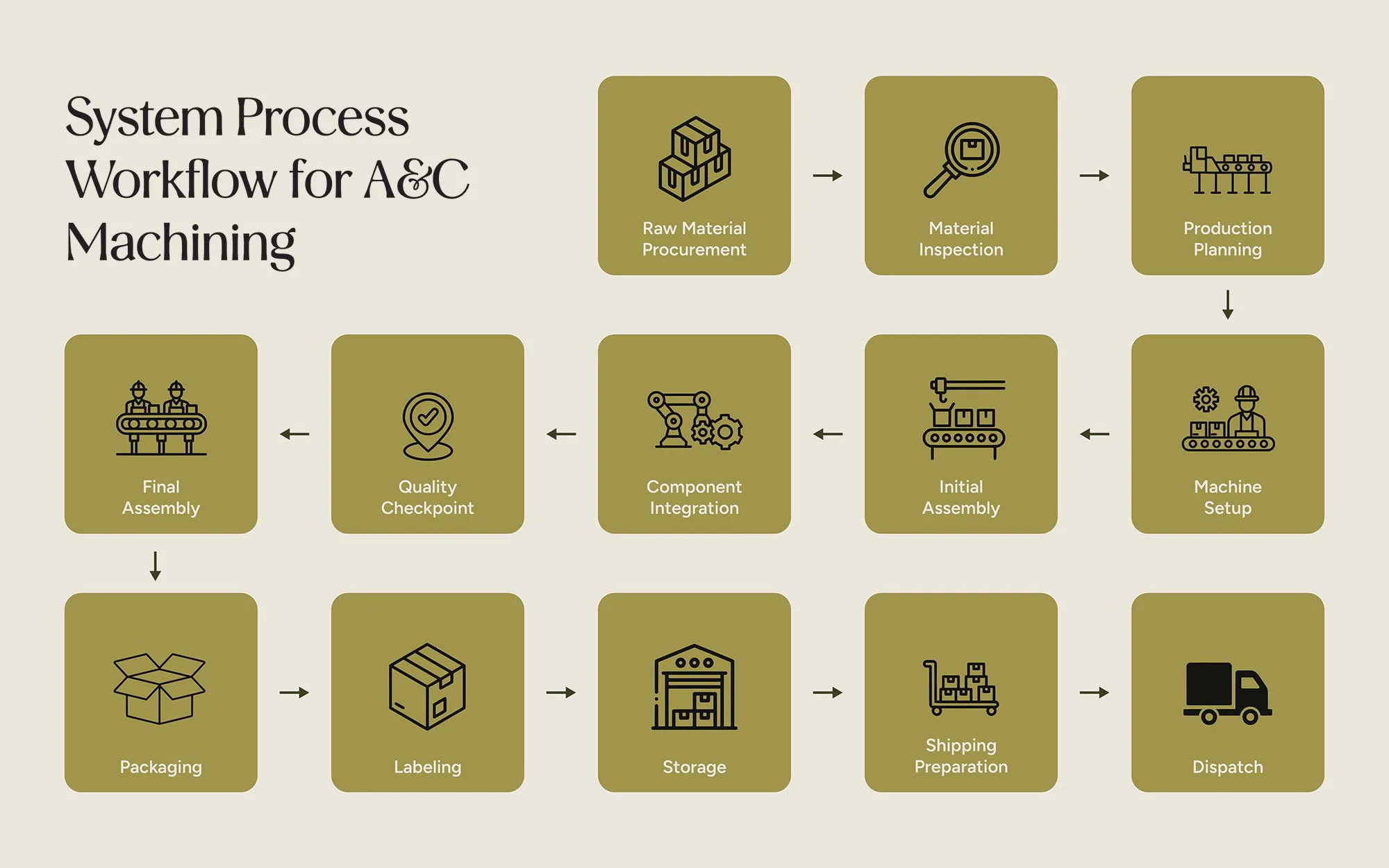
3. Systems, Processes, and Workflows
Written documentation of systems and processes can often be confusing. Infographics simplify these by visually mapping out steps, markers, and cues, making them easier to follow and implement.
Ecosystem infographics are among the most dynamic and rewarding to create. Many organizations underestimate their influence within a broader network. Though developing these visuals often requires research, the result can be transformative. Infographics can condense vast amounts of data into a simple, concise, visual indicator. This is often helpful for senior leaders who value aerial snapshots in the organization to access that area’s overall health.
4. Ecosystems
A nonprofit might use this similar ecosystem model to recognize all the organizations it might interact with. This powerful tool helps showcase the overall ecosystem of those they serve and could provide insights to strategic community or growth partnerships. It also helps show the community and donor base that the organization has a firm understanding of how they serve inside their ecosystem – and that may solicit additional support (financial, resource, referrals) because of this understanding.
Key Infographic Design Elements
Infographics aren’t just a collage of company facts. They should be intentional, focused, and designed to communicate a specific message. Infographics should include:
1. Titles and Descriptions
Titles and descriptions provide context right away, so viewers understand what they’re looking at.
2. Content Overview & Legend
The use of colors, shapes, images and textures are visual guides in an infographic. Any infographic using these visual cues should use a legend to guide interpretation.
3. Key Information
Having data that is accurate, relevant, and easy to understand is critical to an effective infographic. Unclear or misguiding information will only create confusion.
4. Data Sources
Citing sources is an important part of an infographic. It not only helps build credibility to the infographic creator, but it gives credit where credit is due.
The use of organizational colors, fonts, and tone visually ties the infographic to the organization it represents. Fonts should be legible, and whitespace should be used effectively.
5. Brand Consistency
6. Cohesive Graphics
Visual elements should be consistent in style and clearly represent the concepts they illustrate.
7. Clear Flow and Call to Action
The viewer should be guided through the infographic with a logical flow. It should be obvious where the viewer should start reviewing data and where they should end.
While infographics may appear simple, they are often the result of deep research and thoughtful design. Creating one typically requires collaboration between a strategist or analyst and a graphic designer—both of whom must communicate effectively.
If you’re struggling to explain a process, map out an ecosystem, or cast a vision for the future, an infographic might be the perfect solution. I’ve helped many clients bring their ideas to life through visual storytelling. Let’s explore what kind of infographic could work best for you.